Notice To Quit
Notice-To-Quit is an eviction legal service backed by a team of experienced lawyers that remove the complexities of having to remove a tenant for commercial and residential landlords.
I was commissioned to work on the process to request their services into a friendly flow. Later on to make subtle design improvements onto their landing page.
Objective 1: Deliver a process to request NTQ's services without hassle. Gathering all important information of the Rental and Tenant's information in a way that is simplier, direct and easy to later on arrangea personal meeting with the solution at hand.
Objective 2: Make Design improvements to communicate more warmness into the service that can be perceived as “Mean” or “Cold” But something that can reassure the client that they're into good hands.
User Flows
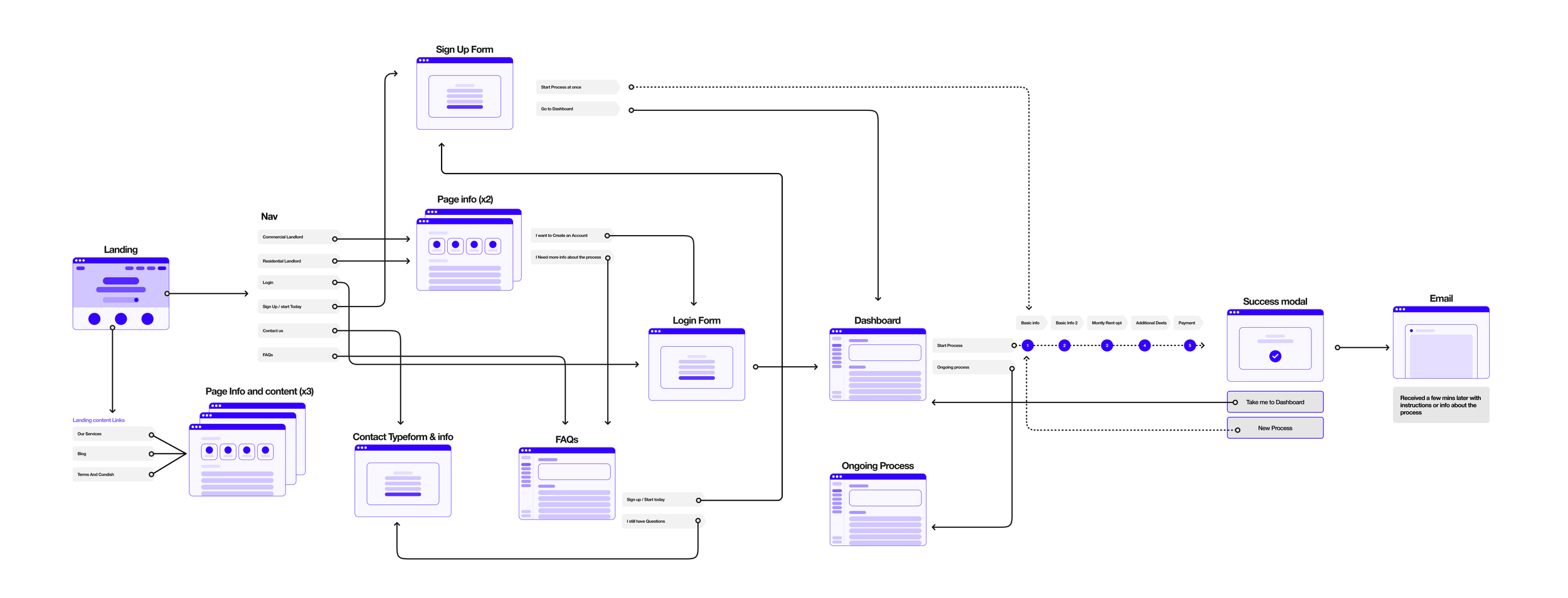
I prefer to kickstart my workflow by collaborating with the client on user flows. This practice not only offers me a holistic perspective but also grants me a bird's-eye view of where various features are under consideration. Clients also find this approach valuable as it prompts them to anticipate forthcoming questions. Furthermore, the landing page and brand assets had already been developed by a different party, affording me a set of pre-existing components to initiate my work with.

User flow for NTQ, defined process after landing onto the page.

NTQ Landing
Brand and assets at hand.
Design
The user flow played a crucial role in clarifying the screens required by the client, distinguishing between their essential needs and their initial requests. At this stage, they were immersed in the second phase of development, primarily focused on streamlining the request process. While the development of a dashboard was on the horizon for the third phase, it fell beyond the scope of our current time constraints. Our initial iteration adhered closely to the client's initial request to work within their existing “guideline,” which included the first brand design at my disposal.
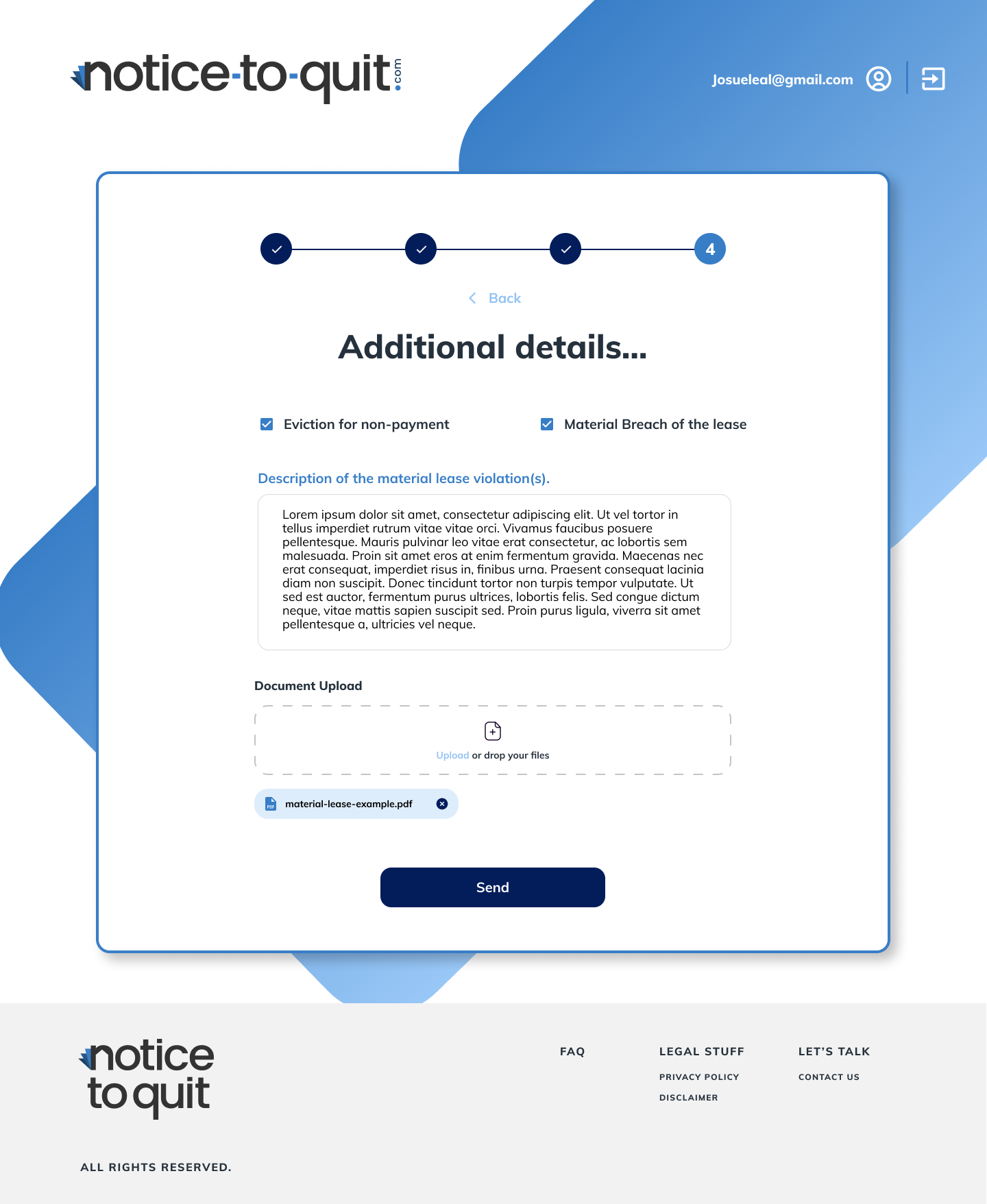
At this stage, I had already outlined the necessary steps, emphasizing that they should not exceed four in number. To ensure user engagement and concentration, I incorporated a UI stepper visualization. This visual element conveys the message that the process is straightforward and won't demand a significant time investment. The intention was to encourage users to view this process as an enjoyable and organized task, akin to the familiar experience of filling out a checkout form while shopping online.
First Process iteration:
Objective 2
Initially, I was instructed not to focus on UI or aesthetics, since someone else would handle that aspect. My task was simplifying the request flow. However, a month later, they requested my design services to create a friendlier and warmer look for the page, given the challenging nature of the eviction process.
I began by crafting a palette to infuse warmth into the existing brand, maintaining its professional demeanor. Additionally, I refined the content layout and recommended images that conveyed a more approachable tone.

Adding warmth tones onto the blue hues helped to make it more modern as well. Adding little spaces with other colors gave me more flexibility for more contrast.
Next, I identified a frequently used shape that served as a foundational element, characterized by its robust and bold nature. To maintain a lighter and more spacious appearance, aligning with the concept of alleviating a heavy burden from their shoulders, I planned to employ this shape as a recurring, subtle pattern. It serves as a decorative purpose, but also playfully guide the user deeper into the page.

Previously, many of the icons and images failed to convey any meaningful message. However, when used effectively alongside text, images can be a potent tool. To infuse warmth into the page, it's essential that users perceive us as experts who can provide reassurance in their time of need, even within a digital environment. This should evoke a sense of connection, making users feel more at ease with the process.

Final design comparison
Initial impression of the landing page: Enhanced navigation with readily accessible, valuable content. Improved layout and text hierarchy for effortless communication.


