03 / Merchants

Merchants*

A closed-loop marketplace concept for a LATAM digital banking platform, built in a compressed timeline to secure executive buy-in for a new business line. *Under NDA — names, colors, and visual details have been altered.

Role Sole Product Designer
Team Product owner · 1 engineer · stakeholders
Timeline 1 month
Status Concept · Paused
merchants.app / marketplace
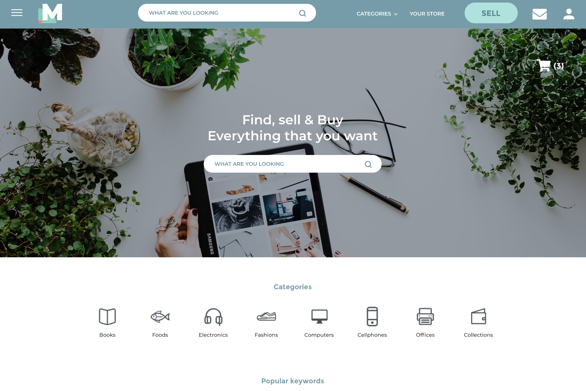
Merchants marketplace homepage

A concept built to
earn its next phase

handshake
Executive buy-in secured
A distinctive brand direction, built in a single month, made the concept feel real enough for stakeholders to fund.
foundation
Foundational work delivered
Concept flows, brand direction, a site map, and mid-fidelity screens were all completed before the project paused.
pause_circle
Paused, not shelved
Cancelled in 2020 as priorities and budget shifted — the brand direction and scoping framework are still referenced internally.

Funding a concept
before it was finished

Executive review was scheduled before the feature set was finalized. Rather than fight the timeline, I made a conscious choice: invest in a brand direction distinctive enough that stakeholders would engage with the concept emotionally — which would buy time for the feature work.

The idea itself was simple: a closed-loop marketplace letting members buy and sell among themselves within the platform's trusted network. Making it fundable in a month was the real design problem.

No user research phase — decisions were based on observable behavior and explicitly documented assumptions.

A moving feature set — scope changed multiple times over the course of the engagement.

A second product for users already inside one — the marketplace needed to feel like an extension, not a separate app.

One month, start to finish, to go from concept to something stakeholders could fund.

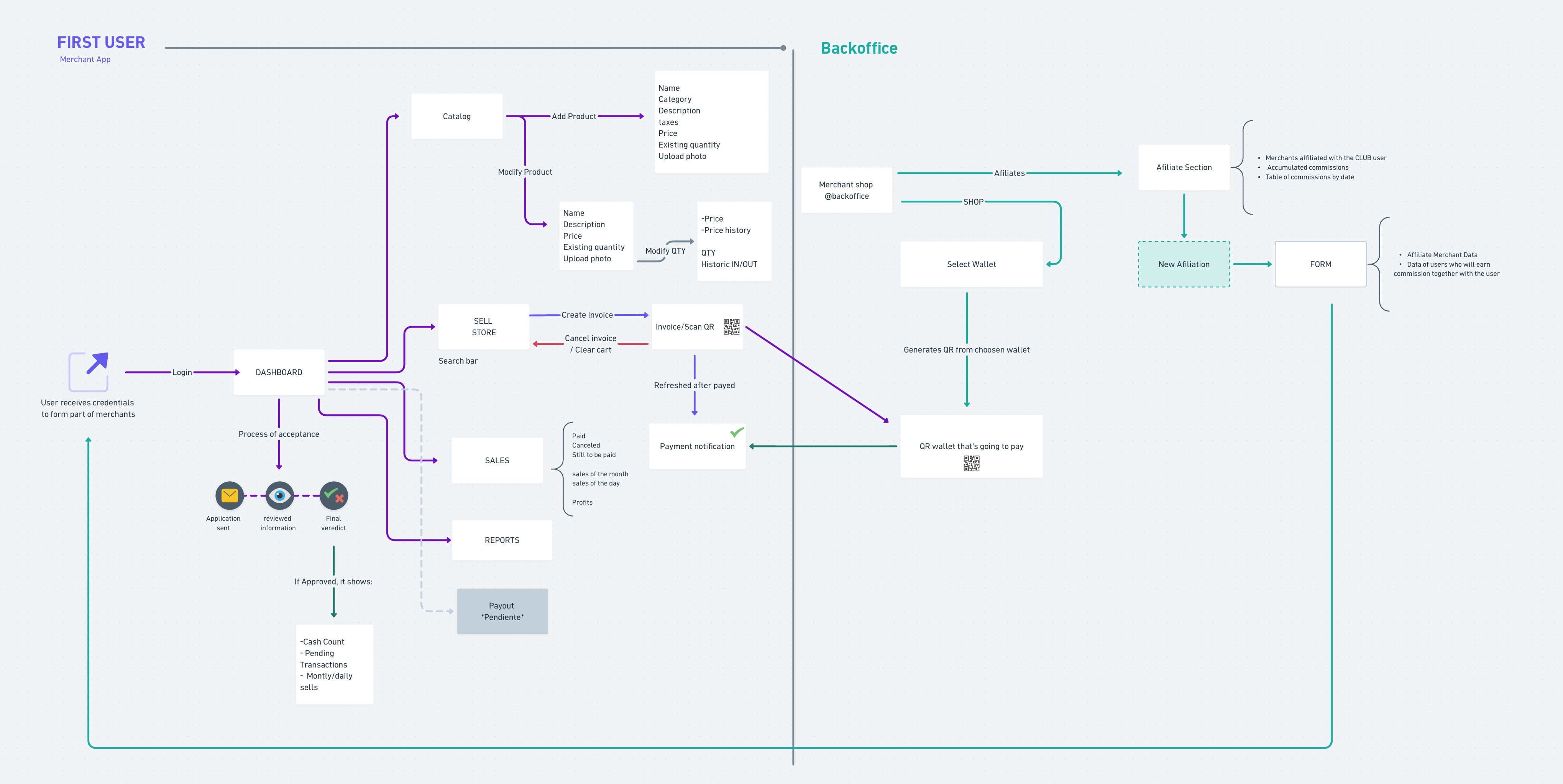
Merchants concept map — first user and backoffice flow chart

Merchants' first flow chart.

Color scheme and first logo iteration — "Merchants," a project alias.

merchants.app / login

Login screen, first iteration.

Merchant Home Screen Account Personal store (SELL) Messages* General Store Cart My orders Settings* Adresses* Product Management* Item search grid Checkout process Wish list* Product reviews Add product Modify product Item Description Delete product

* Undefined / not part of the scope

Site map, censored for public view.

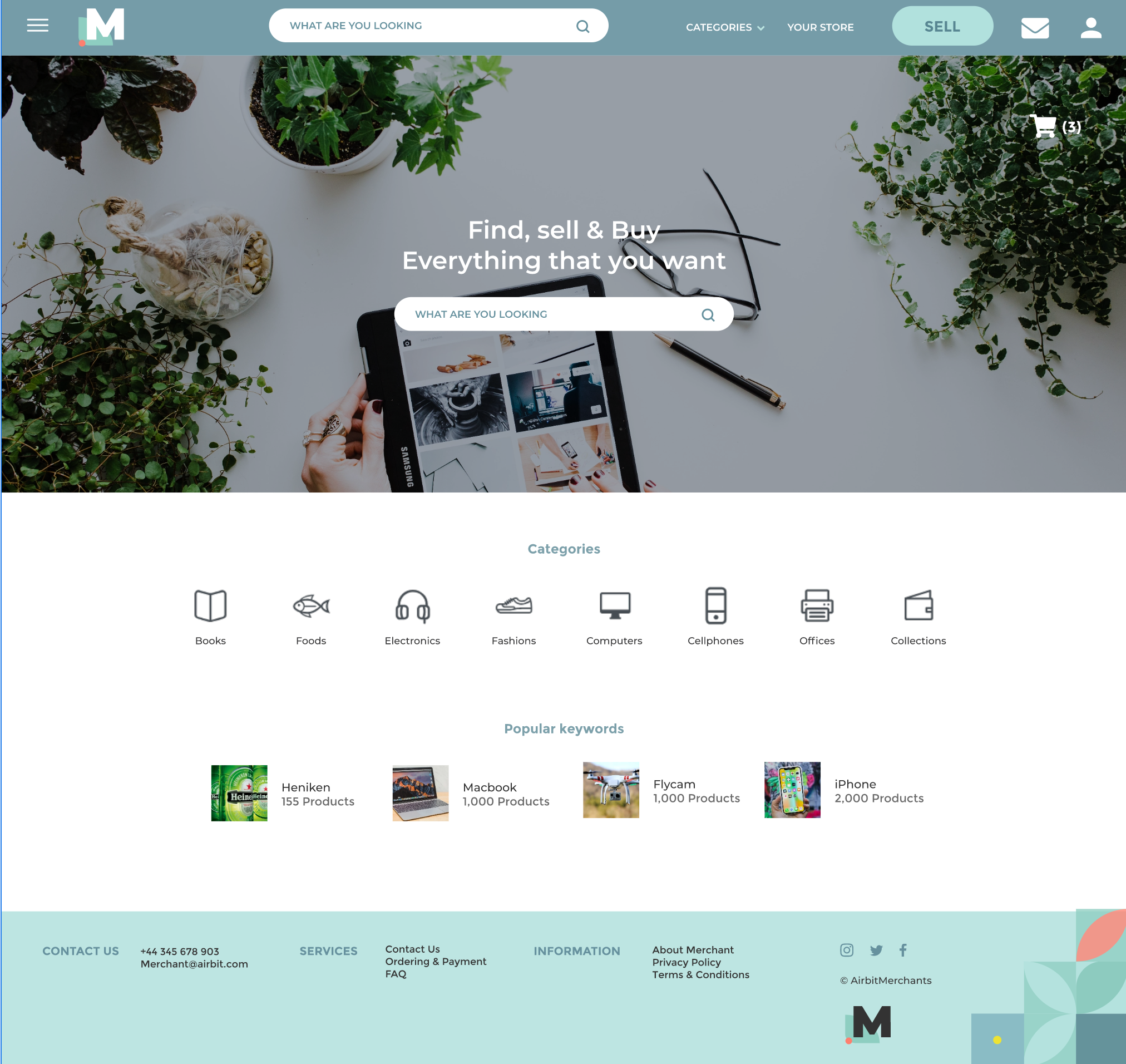
merchants.app / home
Home screen, first iteration
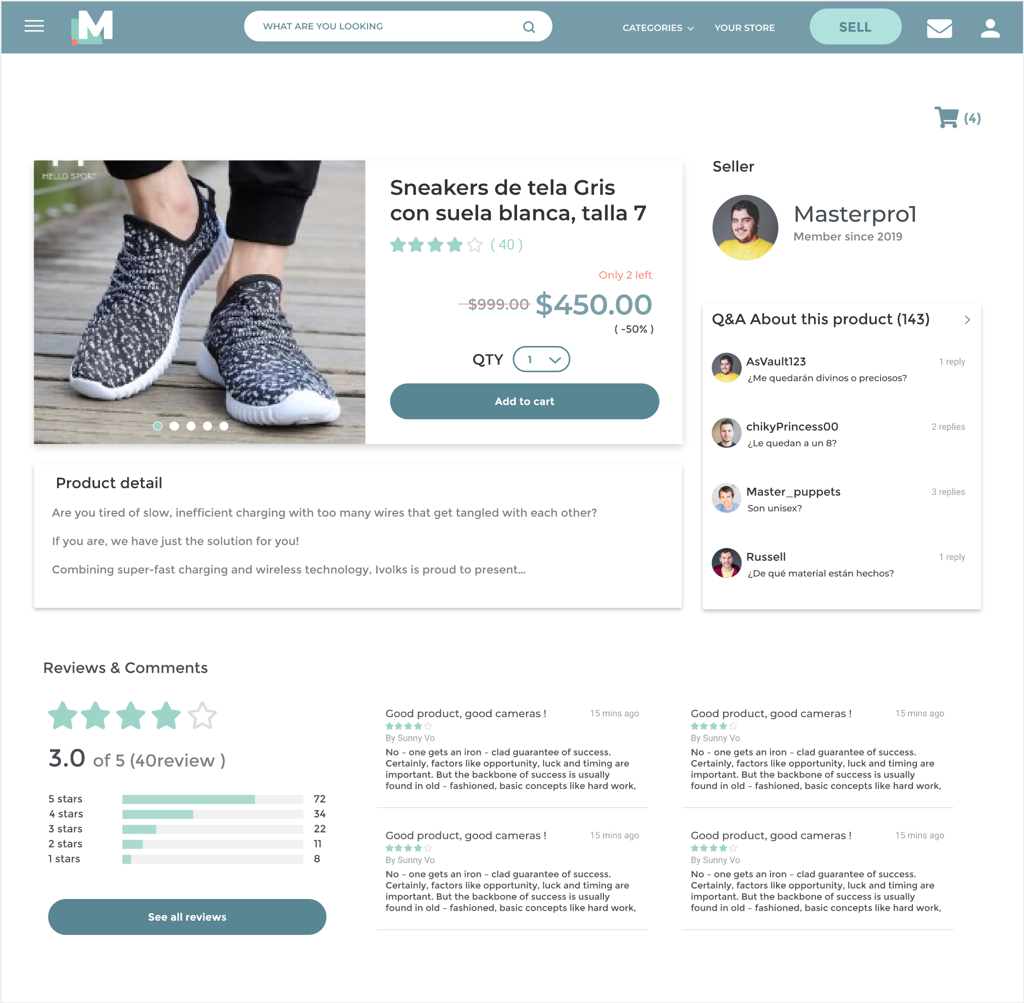
merchants.app / search
Search, select, and view a product
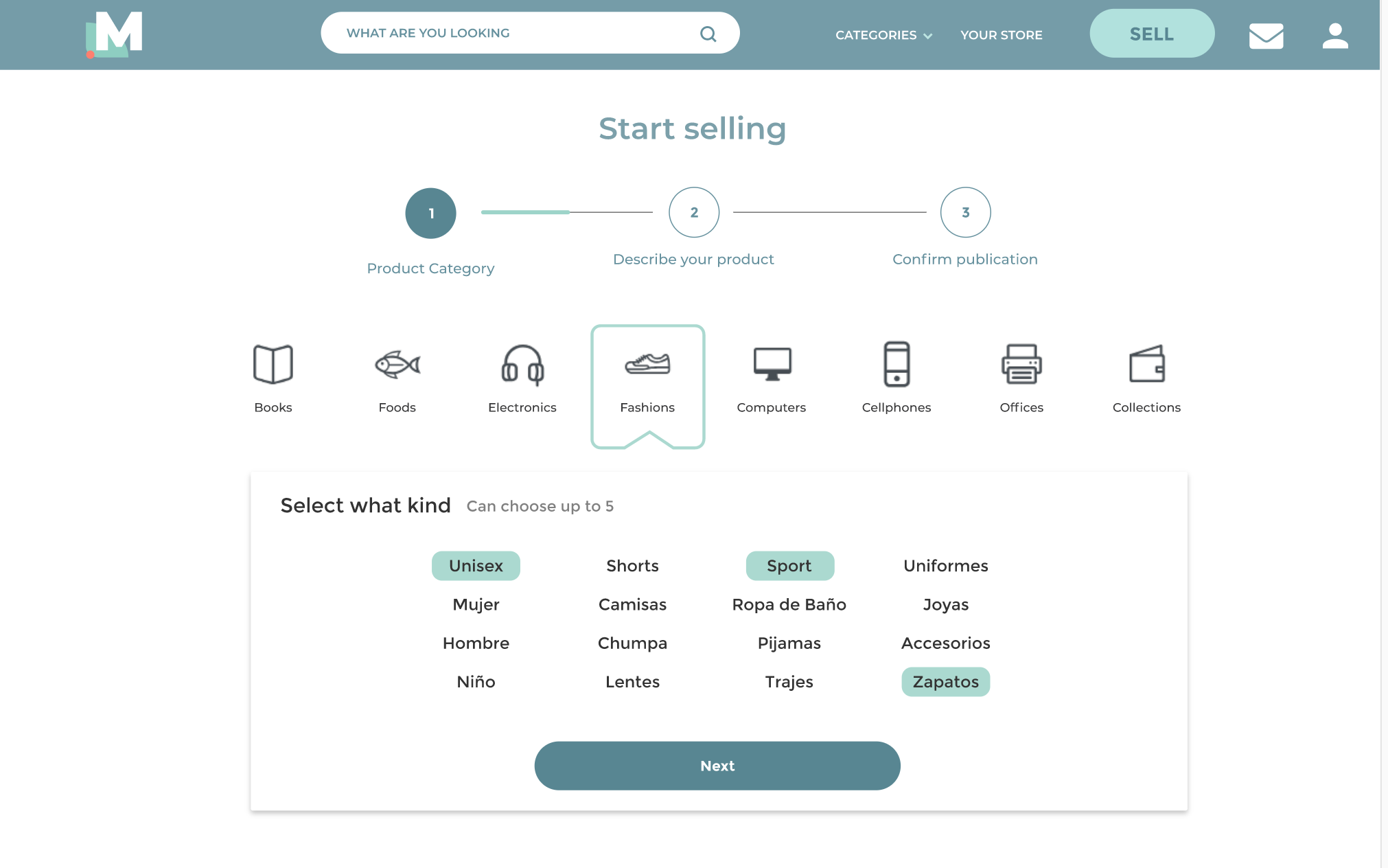
merchants.app / sell
Starting the flow to sell a product

First iteration: home screen, product search, and the flow to start selling.

What made this
engagement hard

None of these were hypothetical trade-offs — each one forced a real decision under the timeline, not just a compromise on paper. A few of them are still worth naming plainly.

No user research in Phase 1. This was the constraint I was most uncomfortable with. I mitigated it by basing decisions on observable behavior — the existing chat-based trading — and by explicitly documenting every assumption, so Phase 2 would know where to validate first.

Designing a second product for users already inside a different one. Members would move between the banking platform and the marketplace in the same session. I spent significant time on the seams, making the marketplace feel like a natural extension rather than a separate app.

A moving feature set. Scope changed multiple times during the engagement. Rather than rebuilding from scratch each time, I built the site map and flow diagrams as living documents, which let us absorb changes without restarting.

Paused, but not
wasted

The project was paused in 2020 when leadership priorities shifted and the budget was reallocated. The work wasn't built, but the brand direction and the scoping framework continued to be referenced internally for the marketplace idea.

The project didn't ship, and I'm okay with that being part of the story. What I took from it was a durable understanding of how design operates when the ideal process isn't available — which turns out to be most of the time, in most companies.

Treat the executive review as a design problem in itself, with its own success criteria. I handled it intuitively then, but I'd now build a pitch narrative with as much rigor as the product itself.

Separate brand exploration from product visual design more cleanly. Collapsing them under time pressure muddied both — with more space, I'd keep them on distinct tracks and let each inform the other.