04 / Notice to Quit

Notice
To Quit

Designing warmth into a legal service people only use on their worst day — two engagements: request flow design, then landing page brand warming.

Role Sole UX/UI Designer
Client Notice to Quit · 2020
Timeline 2 phases · 3 wks total
Status Shipped
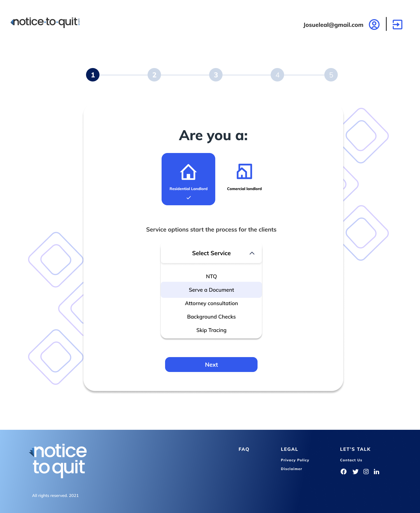
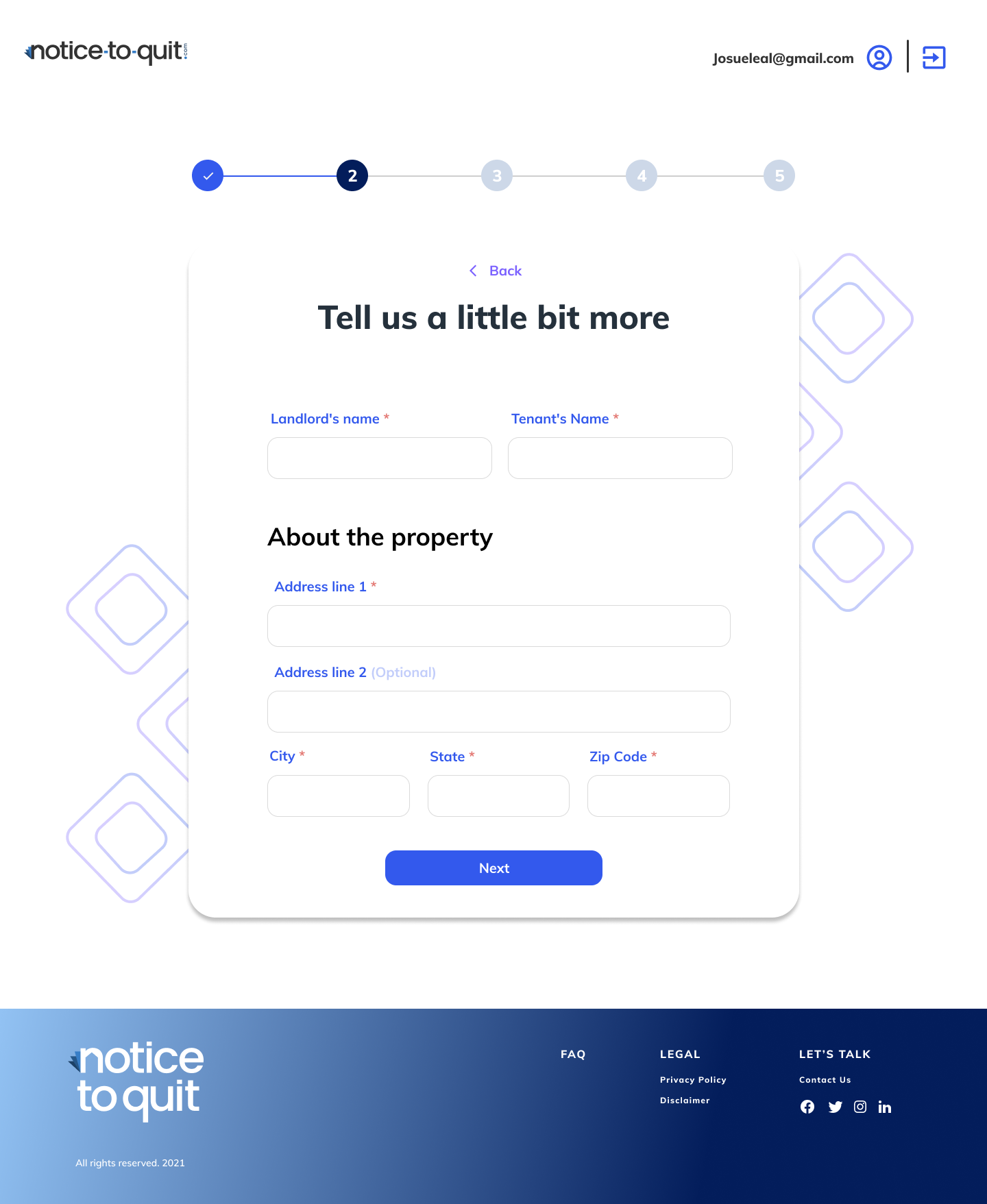
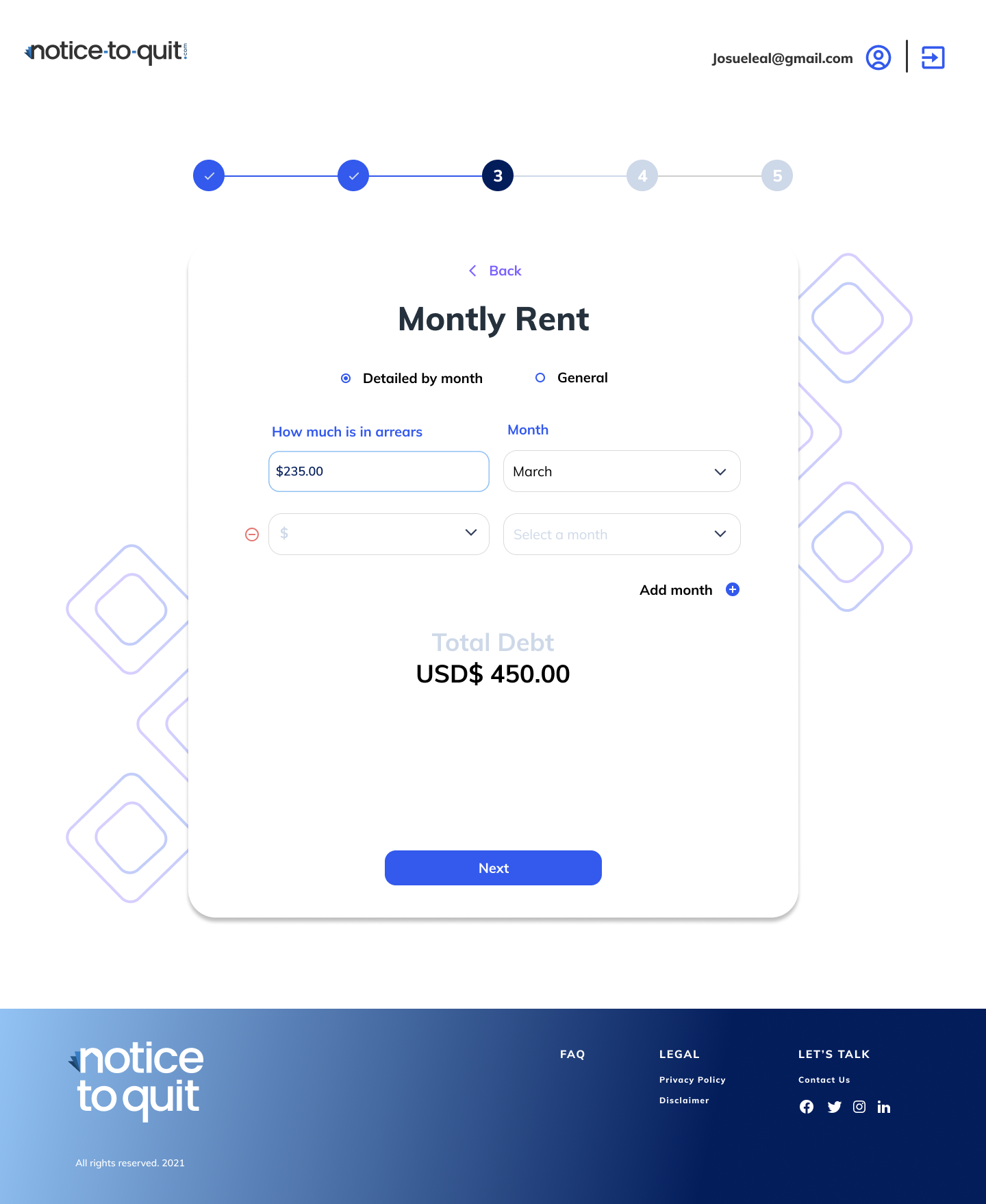
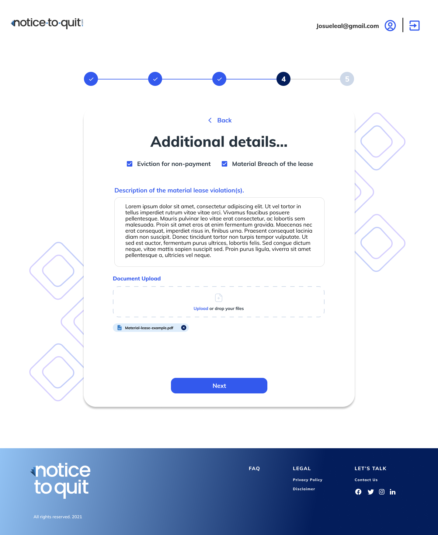
noticetoquit.com / request-flow
Notice to Quit — request flow landing page

Starting with the flow,
not the screens

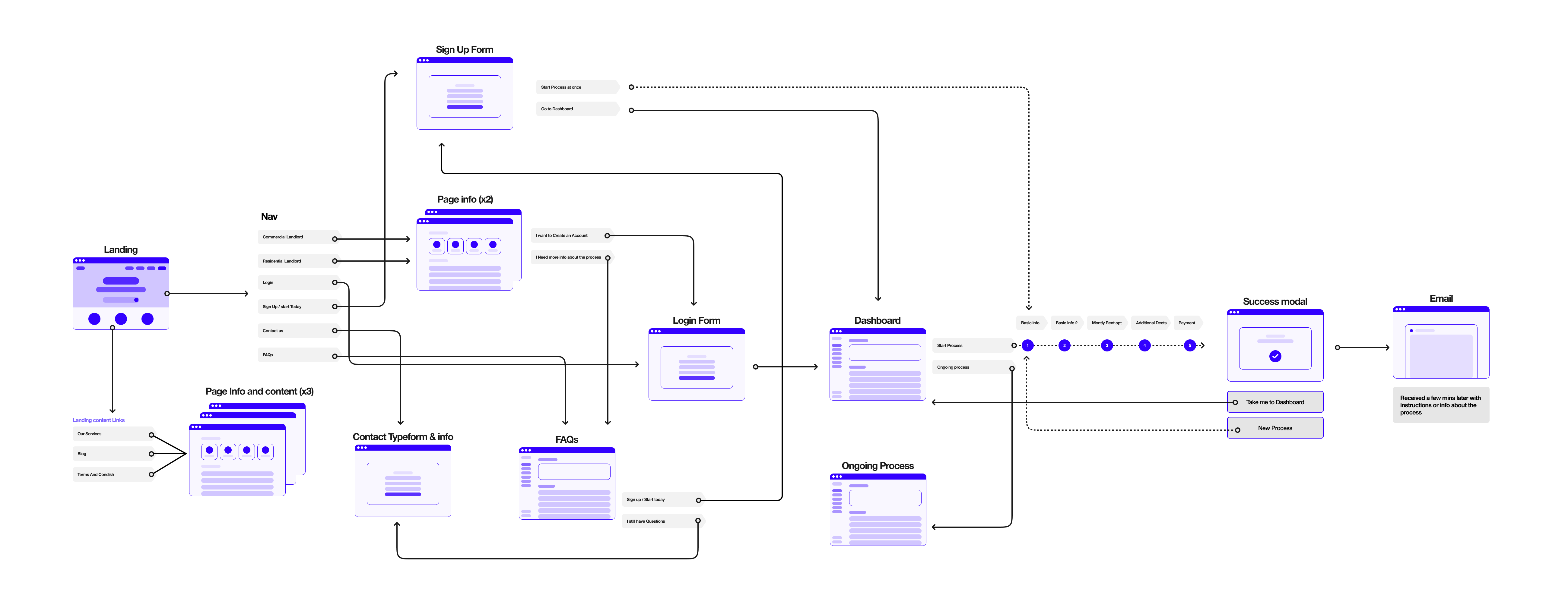
I opened the engagement by building out the full user flow with the client, before touching any UI. This is how I usually start, and in this case it was especially important: the client was still working out which features belonged in this phase and which would wait for a later dashboard build.

Mapping the flow did two things at once:
It gave the client a concrete scope to make decisions against.

It surfaced that a dashboard belonged in phase 3, not phase 2 — which the client had been leaning toward building prematurely.

That scope clarity was arguably more valuable than the flow itself.

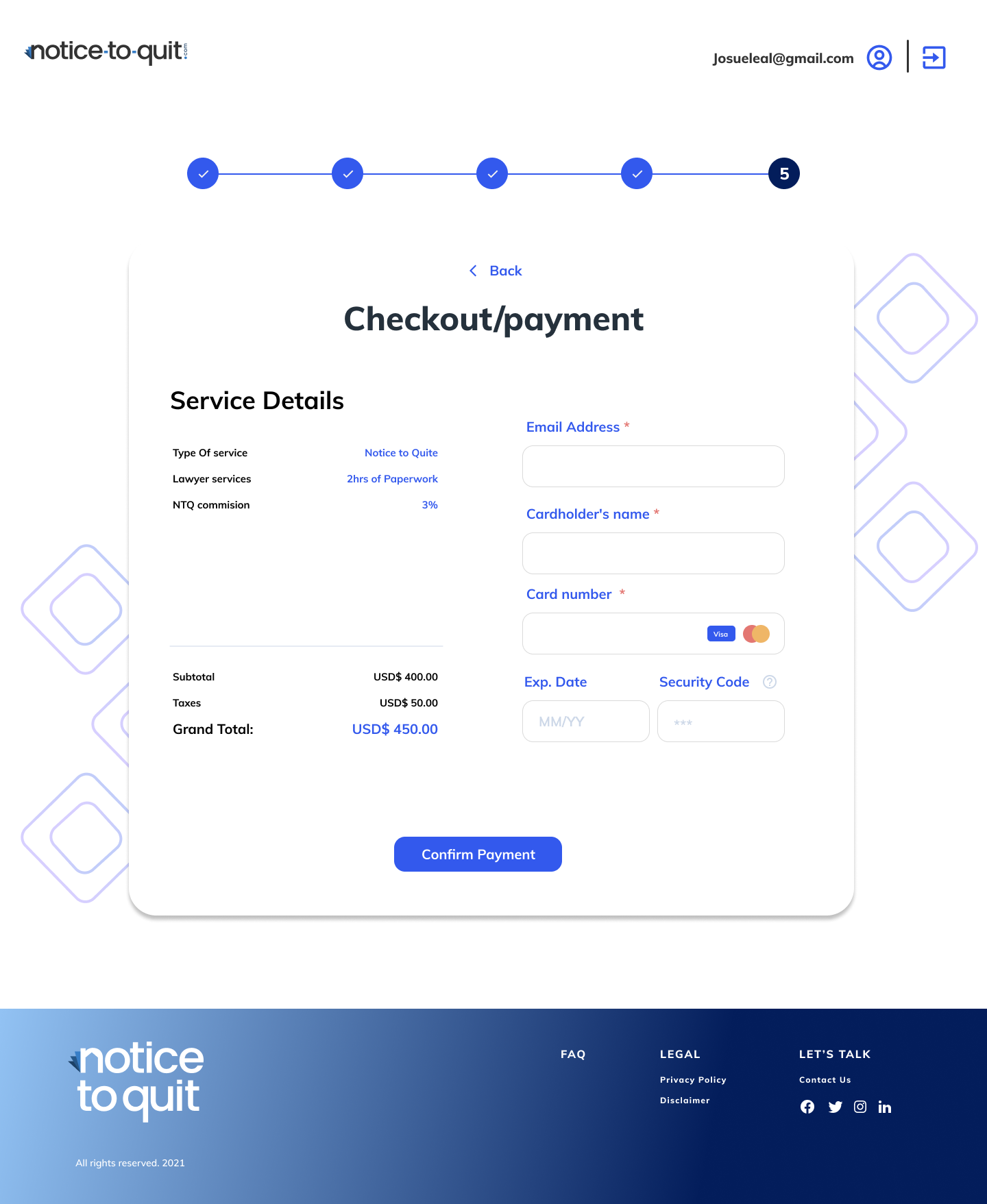
Notice to Quit — full request flow diagram

Full request flow — mapped with the client before touching any UI screens.

The 5-step rule

psychology
Perceived effort matters more than actual effort
A single long form and five short steps can contain the same fields and take the same time, but they feel radically different to someone who's already stressed.
linear_scale
A visible stepper turns an unknown into a finite thing
"You're 2 of 5 done" is quietly reassuring. "Keep scrolling, we'll tell you when you're done" is not.
shopping_cart_checkout
Checkout forms were the right mental model
Users were already familiar with e-commerce checkouts, and the familiarity carried a useful implicit promise: this has a clear end.

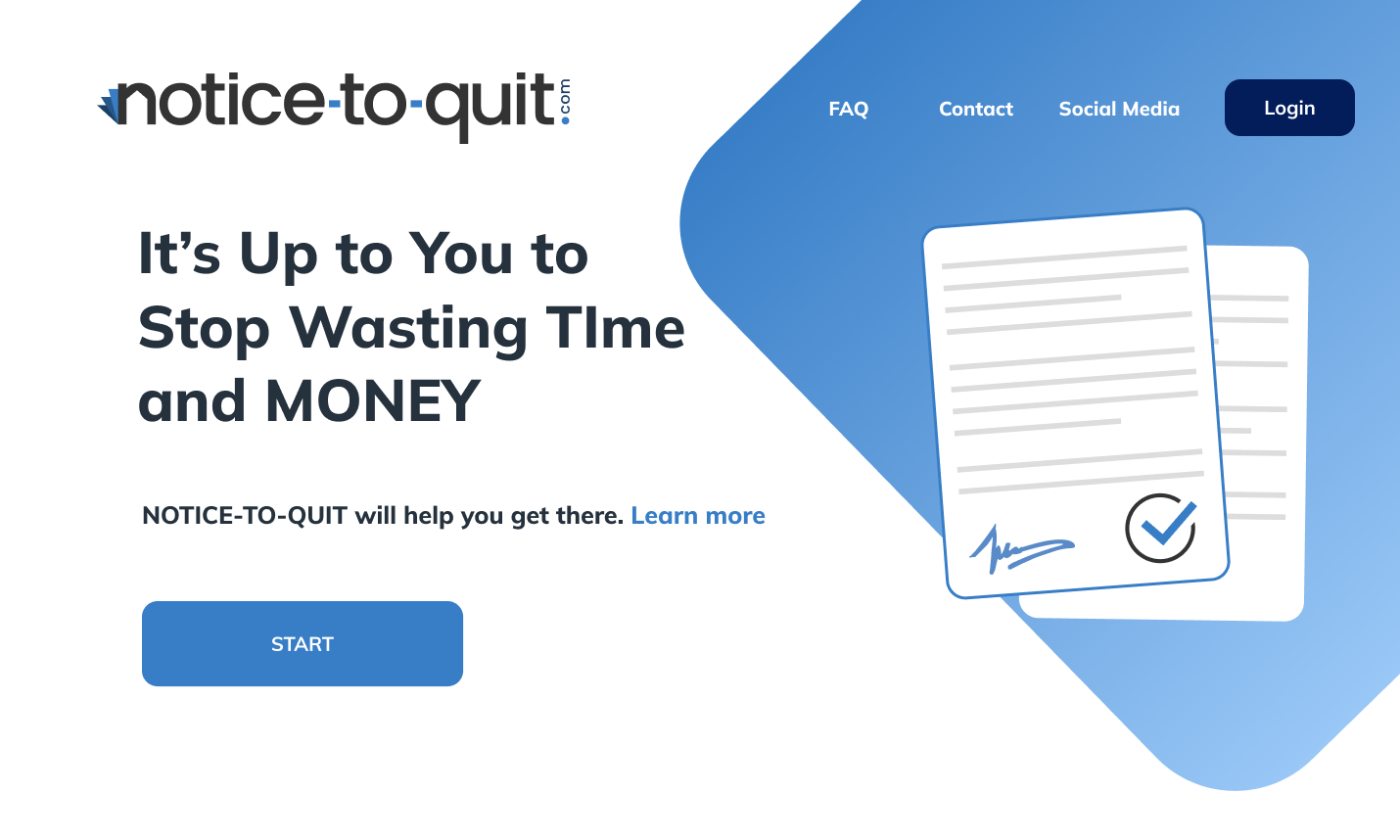
The client came back a month later. They'd received feedback that the landing page read as too clinical for the emotional weight of what users were dealing with. They asked me to warm it up without breaking continuity with existing clients who already knew the brand.

noticetoquit.com
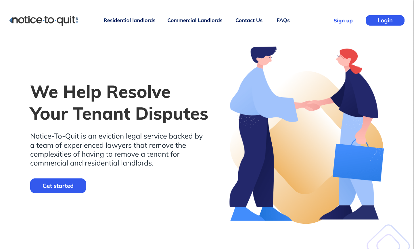
Notice to Quit — original landing page hero, before the brand-warming pass

Deciding what
"warmth" actually meant

Warmth in a legal service is not the same as warmth in a wellness app. If the design leans too soft, it undermines the core promise: that the users are in the hands of serious professionals. I defined warmth for this project specifically as:

Confidence, expressed gently. Same expertise, less armor.

Space and air, because density on this topic reads as legal-document-scary.

Human presence in the imagery, but not performative empathy.

Evolution,
not replacement

I kept the existing blue as the anchor and introduced a warmer secondary palette layered alongside it. The blues became more modern because they had new neighbors; the new tones never fully took over.

Before
After

Adding warmth tones onto the blue hues helped to make it more modern as well. Adding little spaces with other colors gave me more flexibility for more contrast.

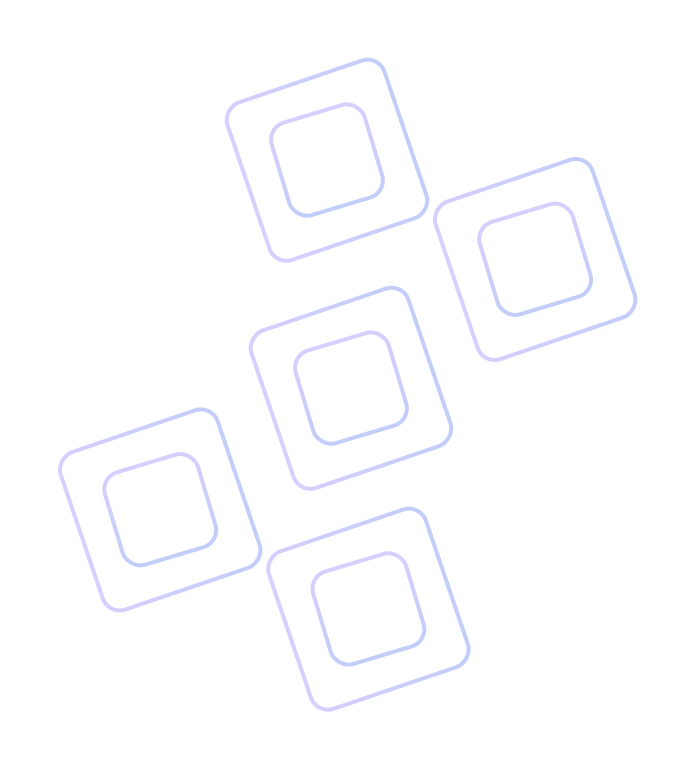
Before After Original brand shape — used decoratively as a bold accent Repurposed shape motif — repeated and scaled down to guide the eye down the page

A pattern that
worked two jobs

The existing brand had a recurring bold shape that was being used decoratively. I identified it as the most recognizable element of the brand and repurposed it: instead of a decorative accent, it became a subtle, repeated motif that led the eye down the page.

One pattern, two problems solved: it strengthened brand recognition, and it solved the UI problem of "where does the user look next" on a page that had previously felt flat.

People,
not decorations

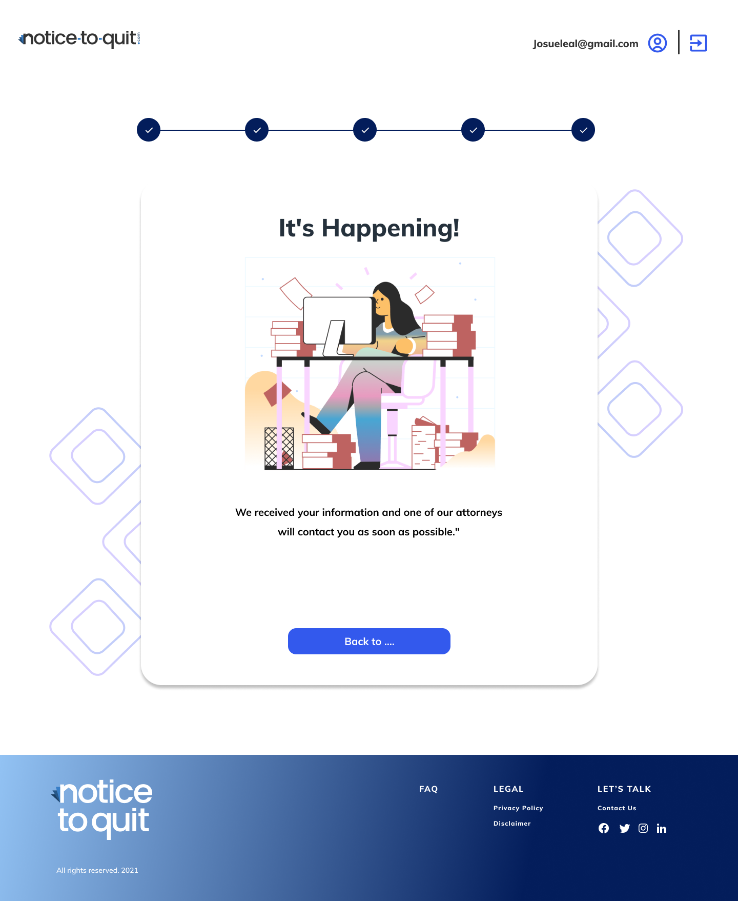
The existing site used stock icons and illustrations that didn't carry any emotional signal. I recommended replacing them with imagery that conveyed human presence — specifically, people in ordinary moments rather than business-portrait posing. The principle: reassurance works when users feel seen, not when they feel sold to.

Notice to Quit — imagery direction shift, from stock icons to human presence

Same brand,
different feeling

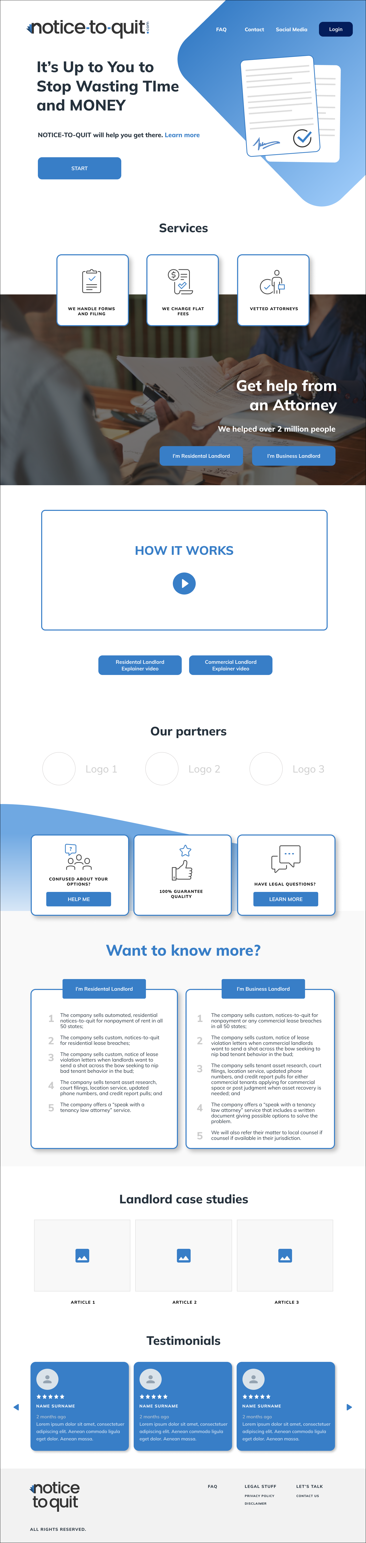
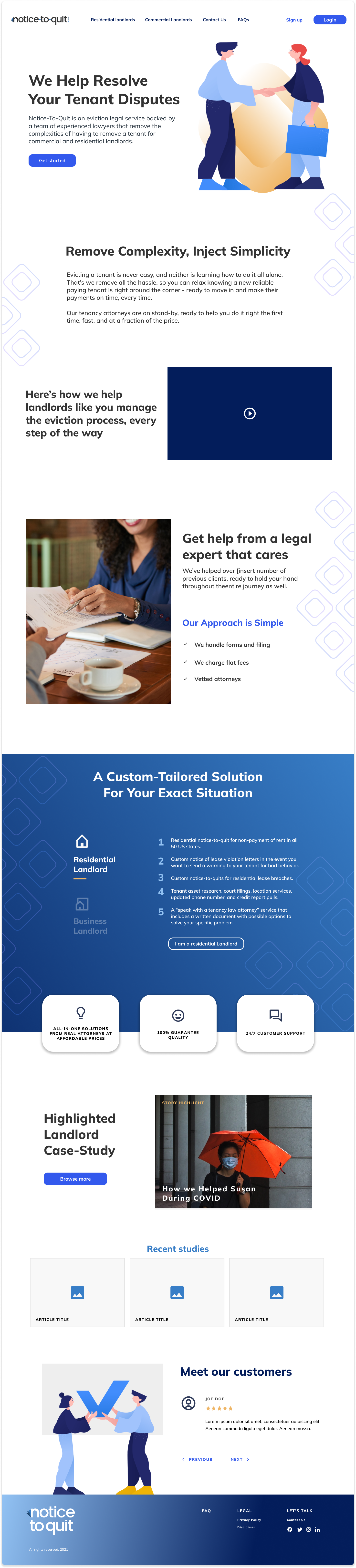
Initial impression of the landing page: enhanced navigation with readily accessible, valuable content. Improved layout and text hierarchy for effortless communication.

Before: dense hero, blue-only palette, generic iconography. After: narrative hero with a clear single promise, warmth tones layered into the existing blue, imagery with human presence, and the brand's shape motif repurposed as a visual guide through the page.

BeforeOriginal landing page
noticetoquit.com
Before — original landing page
AfterWarmed landing page
noticetoquit.com
After — warmed landing page

What made this
engagement hard

01

Inheriting half a brand

I had to evolve someone else's work without disrespecting it. The decision to layer rather than replace was the right call for this client, but it meant every choice had to be a negotiation with an existing system I hadn't authored.

02

Two emotional tones in one design

Competence and warmth pulling in opposite directions. I resolved this by letting structure carry the competence (the stepper, the hierarchy, the typography discipline) and letting color and imagery carry the warmth, so neither had to do both jobs.

03

No direct user research

On a service this emotionally loaded, I would have preferred interviews with actual landlords mid-process. I worked from stakeholder input and competitive positioning instead, and I was explicit with the client about that limit.